Driftwood Stays & Boat Tours
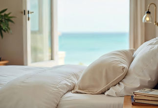
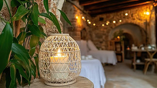
Driftwood branding was designed as a cohesive system that brings together land and sea under one unified identity. Rooted in slow coastal living, the brand reflects a way of experiencing place that feels grounded, unhurried, and deeply connected to nature.
At the heart of the identity is a flexible logo system: one mark representing Driftwood Stays, the other Driftwood Boat Tours. Each symbol captures a different aspect of the experience; rest and retreat on shore, exploration and movement on the water, while sharing the same visual language, line work, and tone. Together, they reinforce a single brand story rather than separate offerings.
The colour palette draws from natural coastal elements, weathered driftwood, muted sea greens and blues, and sun-faded neutrals — creating a calm foundation. The designs which began as hand-drawn illustrations, use flowing line motifs echo tides, horizons, and coastal life, while the typography brings balance and clarity.
The result is a brand that feels intentionally simple yet superior. Driftwood is positioned as an experience-led coastal offering, appealing to travellers who value authenticity, nature, and meaningful time spent both on land and at sea.